I AM KINETIC.
This is the slogan and name rolled into one. It is a play on words that both demands remembering and challenges commonplace brands in its sphere of influence.
I AM KINETIC came to me for a complete logo overhaul. I also did all their printed materials for an upcoming tradeshow.
My thought process was simple: Kinetic means movement. I thought of kinetic energy, which was so versatile for branding I couldn’t pass up the chance. I knew this name was loud and vibrant, so the colors should follow suit.
With these basic parameters in mind, I came up with a variety of iterations. Here is a cross section of my thoughts.
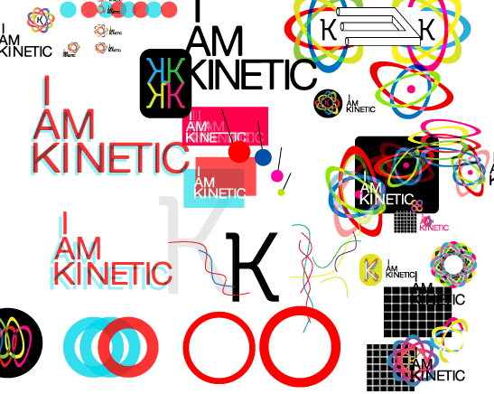
I then moved forward with a few of these I liked.
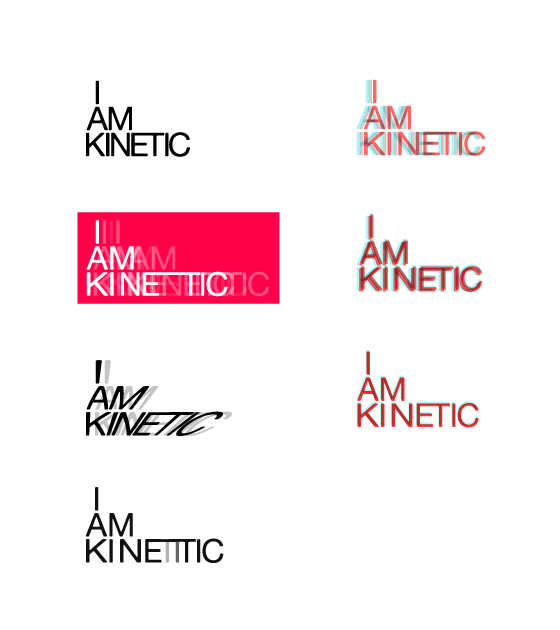
These designes were influenced by stereoscopic imagery, giving it a 3-d efect by overlaying transparencies of the text and shifting them in different colors. This gave a very cool effect, but as a memorable logo, it would have needed strict branding signals to help reinforce this concept. So I moved back to the drawing board, considering the type arrangement itself complete.
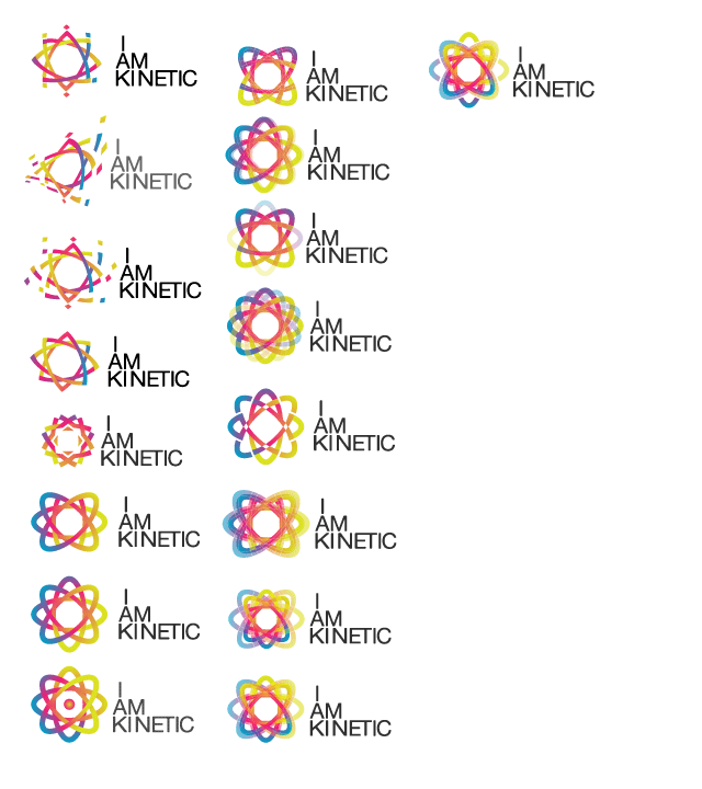
This next round was based solely on the concept of atomic structure. Atoms are truly the basic of kinetic energy, so I felt it appropriate.
I tried many permutations as seen above, but I eventually finalized this one, and polished it up:
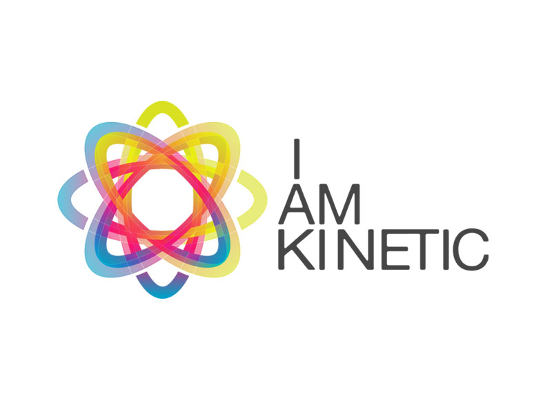
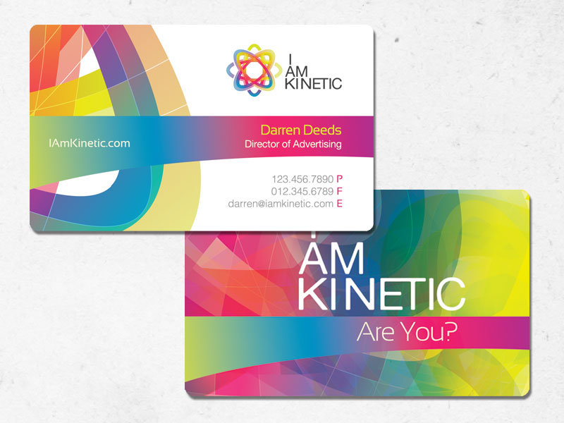
Once done, I applied it to business cards. The color was vibrant and truly gorgeous looking:
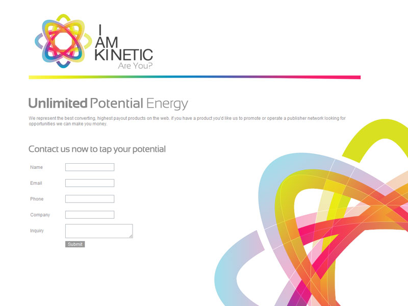
And lastly, applied to a basic splash page meant to serve for new registration:
This project was a major success and turned out very beautiful. The aesthetic was the biggest motivation for the branding and it was better than expected.