Meadow Mortgage is a local (Bellevue, WA) banking company with a friendlier face. They set out to give their look something a lot more friendly and less corporate. As a small bank, this was easily aligned as the proper art direction.

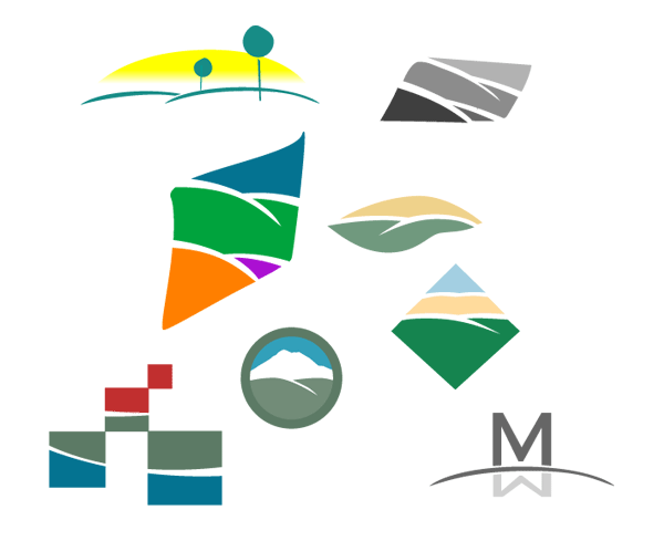
Initially I started out with creating layers and experimenting with highly abstracted perspectives of hills to drive the idea of “meadows”.

Eventually I settled on using the single M as the image, and combined the layered hills into a colorful abstraction.


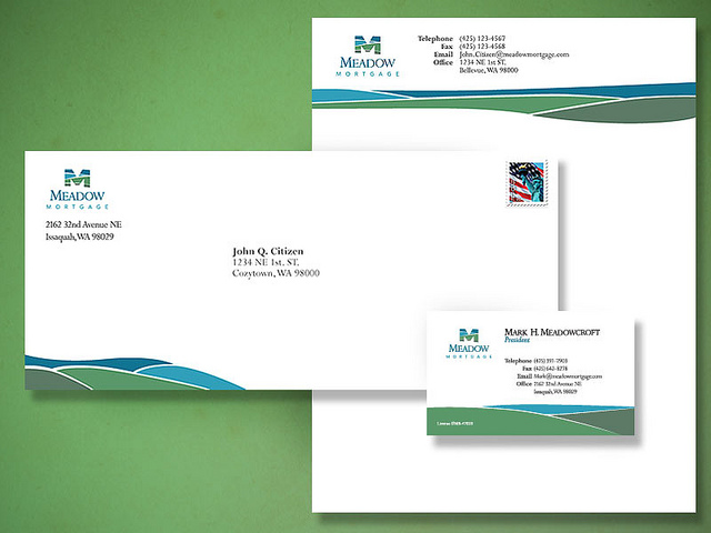
The first piece of collateral I made was the business cards. I started out by making some banking symbols that tied into the layered graphics. I thought this looked pretty nice, but it needed refinement and ultimately it was declined by the client.

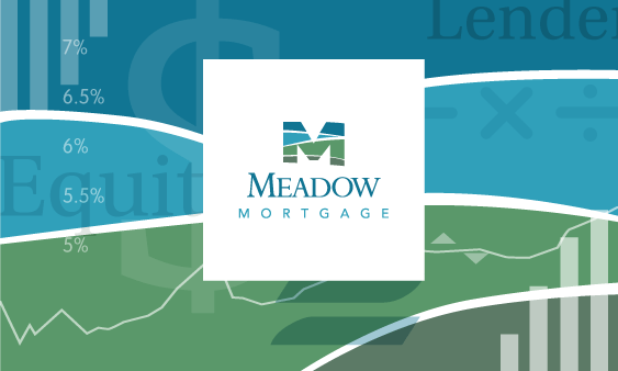
The final pieces use a much more simplified version. The layered abstractions int a few different variations set the tone for the full set of collateral. The full bleed on the envelopes was especially nice and set them apart from “overly corporate” tones commonplace in banking aesthetic.