The T-Mobile “Loyalty” program was devised to create a cohesive brand for employee loyalty. It was a completely internal project –meaning it was never a forward-facing design. This was meant to capture the attention of employees through a series of presentations, work guidelines and printed brochures that would follow the strict brand styleguide but still have a friendly “icon” that was memorable for employees.
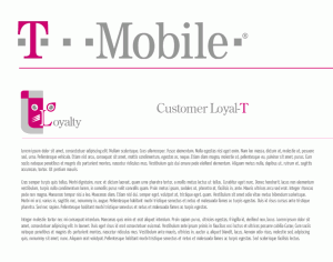
Here’s an example of the final logo applied to some text documents. This was preliminary and didn’t include any of the style guide requirements for layout.

Working with Alchion Design Lab, I quickly started on my own sketches, developing many concepts for the very fast turnaround of 2 days (weekend.) As you can see, I created a lot of concepts and variations on the outset.
![]()
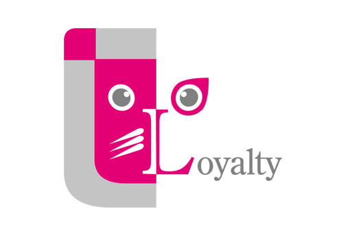
The final result below.

I wanted something simple, clever and friendly. I thought of using various robotic mascots, giving it a techy feel. But I eventually steered away from that concept as the logo slowly evolved into the final “lion.” I decided on a lion because it was both strong and loyal –a whimsical friend.