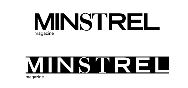
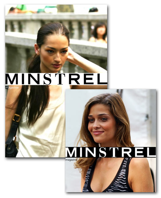
I thought it would be cool to make a “high-fashion” logo, and see some potential applications on a magazine. I’m pleased with the results. This was a pretty quick excercise, half an hour tops.
Photo Credits: http://www.flickr.com/photos/christopherpeterson/1388412246/ http://www.flickr.com/photos/christopherpeterson/1407760482/ http://www.flickr.com/photos/tiagochediak/
Here’s the initial logo, with a reversal that is a bit more edgy. The reversal is meant to go full bleed, touching the edges of whatever it’s applied to.

I made the majority of the letters sans serif (font list below) to give it a bold feeling. I used a grotesque sans serif to give it the wide and powerful fashion feel. I then used a fashion oriented serif to emphasize “ST” which represents “street” –in this case, the various streets of fashion.
I found some supermodel photos on Flickr and did some type arrangement and logo application. Looks pretty legit!


The fonts used for the logo itself (and the primary/secondary typeface) are Trade Gothic Bold Extended, and Bauer Bodoni Bold. The “magazine” and issue date lines are set in Avenir 45 light.