This might be quixotic for most applications, but major type refinement is a MUST if you are working on any kind of icons, logos or otherwise permanent fixtures of typographical illustration.
You might want to read my article about tracking and kerning tips before delving into this article, because a lot of what I talk about will be covered there. Assuming you have already read it, or have a basic understanding of kerning/tracking/concavities, let’s get started.
Why do we refine type?
Type refinement is an art for perfectionists. It is a pixel-perfect craft of careful deliberation and must be considered for certain jobs.
It can sometimes even make or break the look of a logo.
The reason why we must refine type is because it’s hard to design a font that works universally yet fits every kerning pair appropriately. No matter how well the font is designed, you’re bound to have some nooks and crannies that need to be spaced, adjusted or just plain removed.
How about I show instead of tell?
So let’s start off from scratch, with a fake client and everything. I made a company called “Mythico” which sells books & novelties. This is a simple and easy to make logo that will benefit greatly from major type refinement.
Starting off, heres' the type out version—NO ADJUSTMENTS:

And here’s a zoomed in version, showing the uneven and inconsistent whitespace inside each character. Our goal is to even it out for each character, and for the logo overall.

Now, the first step would be to do some basic tracking and kerning. We can do this with the adjustment tool, or, if you’re like me, you can break it into paths and start adjusting it pixel-by-pixel.
Remember the tips from my previous article, about rounded corners—you’ll want to bring them closer together, compared to other kerning pairs.
Unless you are going for a specific effect, it’s usually preferable to pull the characters closer together, or “tighten” them up.
Here’s the first version, nicely adjusted:

And a zoomed in picture, showing the difference in whitespace adjustment:

Now, a lot of logo designers will stop here. For me, this is only the beginning. But often times people will see it as being finished, and the client is none-the-wiser (unless they have a discerning eye.)
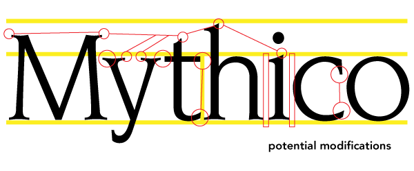
Assuming we AREN’T done, here are some modifications I might expect to do:

The yellow lines represent baseline and height adjustments that I would make so everything is flush to those edges.
The small circles represent inconsistent serif types. In a logo, the serif type should match. If it’s pointy, square, rounded or otherwise, they should all match.
The vertical bars represent more tracking that needs to be done.
The large circles represent serif pairs that stick out inconsistently—if a character has more than one serif on a side, those serifs should all stick out the same distance.
Now, bearing all this in mind, we can set about making all the changes.
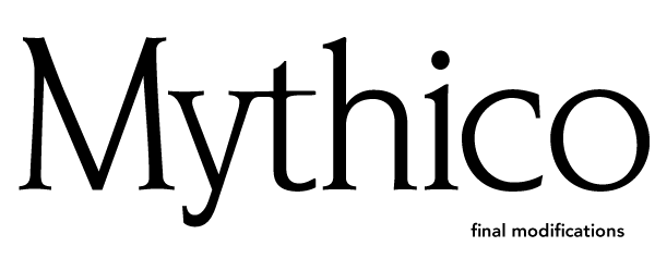
(Pulling out a fresh baked logo, chef-style) Voila! Here is the final version.

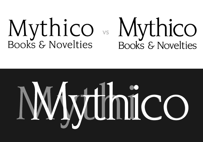
As you can see, the difference is pretty substantial. I’ve overlayed the original (completely unmodified) and the very final versions.

In a real client case, we would do the same level of modification for the smaller text. That is a bit tedious here, so I’ll let you take my word for it.
Truly stellar typographers, refiners and illustrators
Hydro74
Joshua Smith from Hydro74 is a bit of a legend in some circles. He is quite a talented illustrator and typographic artist. He has done shirt and poster designs for a multitude of big names.
Joe Finocchiaro
Joe Finocchiaro is probably the final word on type refiners. He has quite an impressive list of clients from Contintental Airlines, WarburgPincus, ChevronTexaco and Northwest Airlines.
He has developed both symbols and word marks, along with custom corporate typefaces.