
Barcodes are interesting little inventions. Like most truly novel ideas, they would probably have been regarded as totally absurd ideas in their time. But it’s this “absurd” way of thinking that leads us to breakthroughs.
An ultra-brief history of bar codes.
Did you know bar codes actually started out as concentric circles instead of lines? They were called “bulls-eye” symbols and were patented in 1958 by Joseph Woodland and Bernard Silver. These two guys decided to invent the bar code after a local chain of food stores asked them for a solution in making items unique.
They had started with some rather odd little variations: the bulls-eye method used ultraviolet light ink. They eventually settled on the bar code, which was chosen because it made a much simpler pattern—very simple in fact, yet able to produce a ton of unique “identifiers”.
Interesting note: Wrigley’s gum was the first item to ever have been scanned with a bar code!
*beep* welcome BrandCodes
After doing some lengthy discussion about kerning pairs and tracking, as well as the intricate differences in space around a logo’s letters, I kind of found a pattern myself.
A logo really is a bar code, if you count only the spacing between the letters. Wouldn’t it be interesting if we looked at logos by their negative space instead? I realized that this practice produces a consistent pattern of lines that are still unique entities, just like a barcode.
Here are some examples of the original logos and their “brandcodes” revealed:
Gucci has a simple brandcode. Not a whole lot, but very evenly spaced.

Dolce & Gabbana on the other hand, has a very uneven and long brandcode.

Vodafone, like it’s name, has a pretty even brandcode. When it comes to symbols, I always make sure the “icon” or “symbol” is merely measure as a space like everything else. With this in mind, you can easily tell where the Vodafone icon ends, and where the letters begin.

One thing you might notice is that many letters seem to be missing stripes. This is the especially prevalent in the Google logo. Whenever two letterforms are so tightly tracked they have no space in between them. these are left blank.

BrandCode uses
So this is a pretty novel little concept, but what are its uses? Here are a few I thought of:
Computer vision brandcoding
Maybe we can use image recognition specific to these logo brandcodes. We could:
- check for valid logo usage (i.e. if a company is using the right/current logo)
- help auto-categorize images by shaping the recognition software to interpret logos which all share this distinct feature
- help automatically interpret a page layout by way of logo placement in relation to other semantic data (navigation, headlines, etc...)
- create a "logo search engine" that can be used as an image resource
- create software that checks legibility, readability and other "stress test" measurements to evaluate a logos visual strength
Bar code 2.0: QR codes
Japan invented the QR code. Specifically, it was invented by the Denso Corporation. So simple, but seriously powerful. A QR code is a 2d barcode that represents much more data than a 1d barcode. It does this by creating sections of patterns for a QR-enabled device to decode.
There are tons of uses for QR codes. A lot of brands use them for mobile engagement: take a pic of QR code => go to a website. You can even store lots of useful information in a QR code.
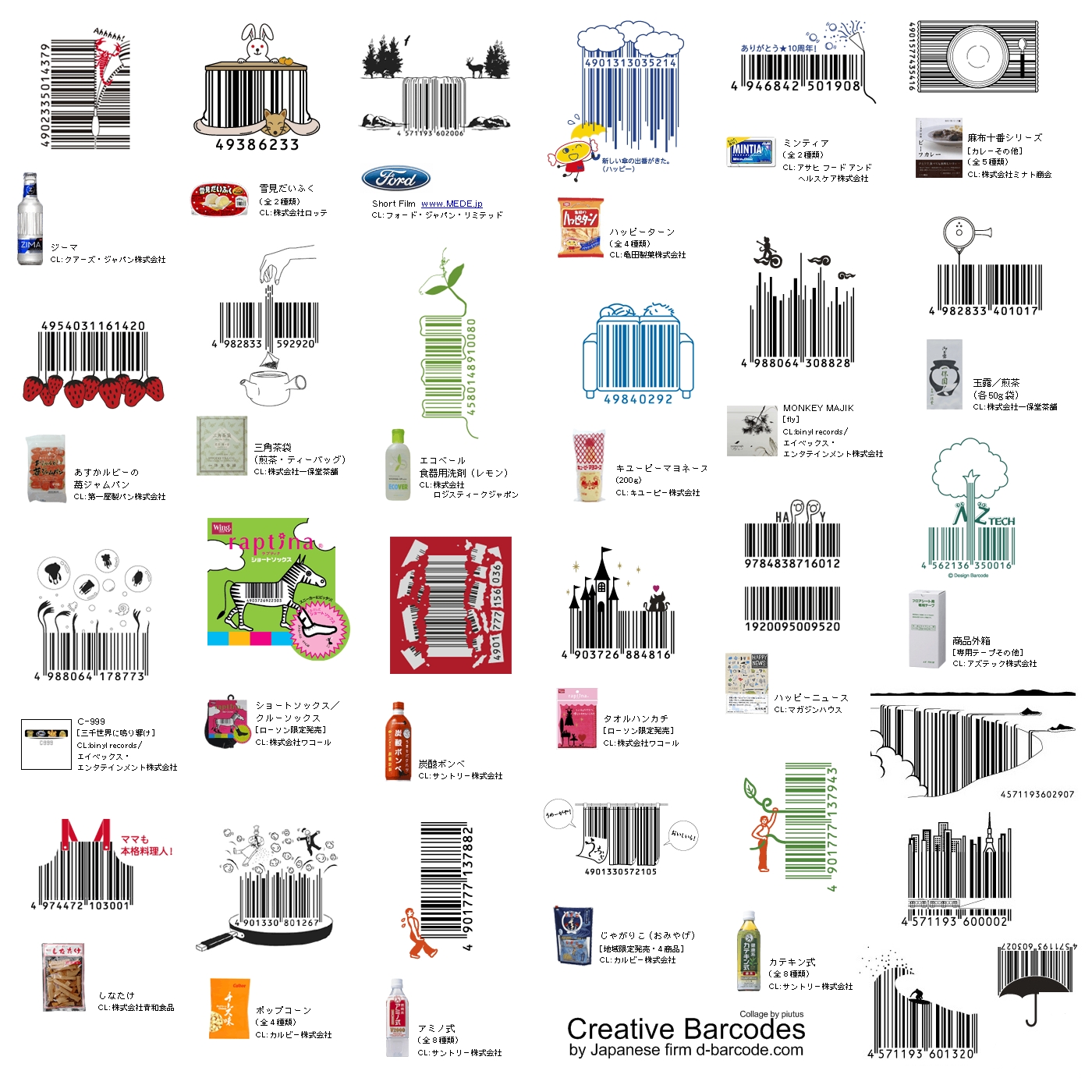
One other note: creative uses of bar codes
I had to throw this out, cause it’s so damn cool.
http://popsop.com/wp-content/uploads/japanese-barcodes-big.jpg
Japan, once again truly innovators in their own right, have taken standard bar code design to a new level. They’ve found a way to add creativity into a bar code while still following standards that allow it to be read by scanners. You can check out this cool trend on the Bar Code Revolution website.