Recycle United was a project I worked on at Punch Drunk. It was relatively simple: a 4 page brochure highlighting the areas of expertise and involvement for the company. My task was to give some flair to their brand. They’re slogan is “breathing new life into old materials”. My goal was to breath new life into their stuffy designs, making it friendly and appealing in the context of recycling.

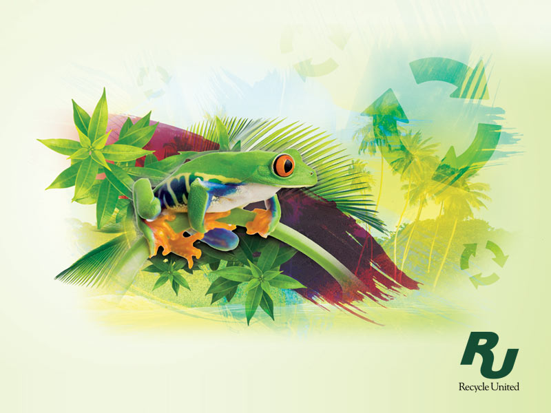
I created a mascot for this piece, a red-eyed tree frog. Using lush graphics and vivid colors to weave together a collage of tropical foliage, brush strokes and the frog, the piece instantly became intriguing and recognizable, especially compared to most recycling graphics in similar fields.

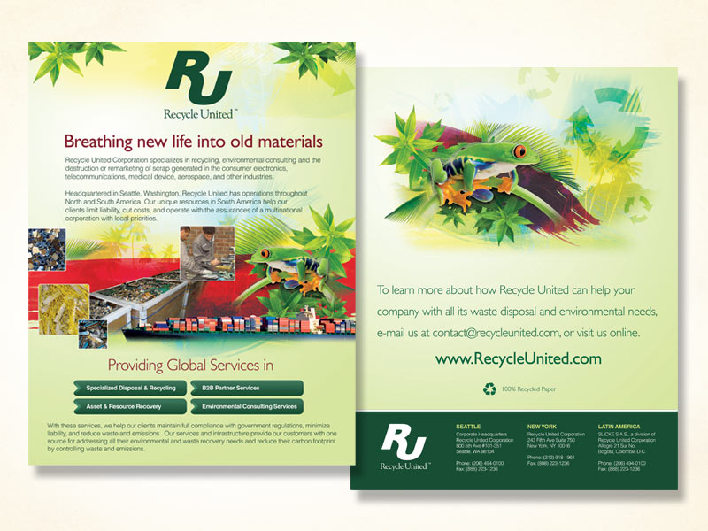
I extended the graphics into various elements across the printed piece, decorating it with foliage and splashes of color and graphics while giving the text a simple and clean treatment. The back reiterates their purpose and reinforces the nature aspect as well as the frog mascot.

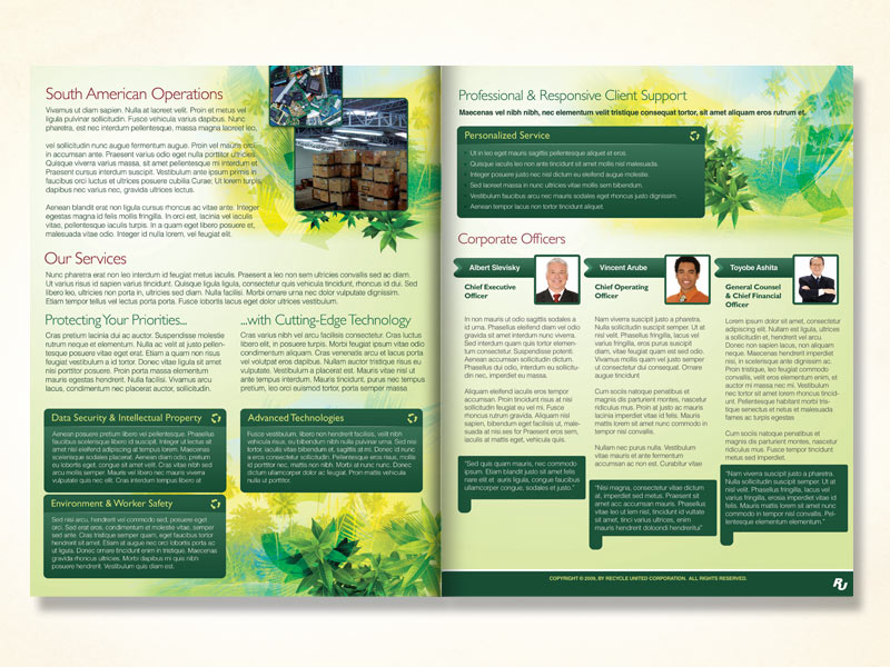
There was a lot of content that needed to fit on the inset pages, without looking cluttered or affecting legibility. I broke everything up into sections and used colors and boxes to highlight them. A lot of typographical adjustment went into the revision process to make everything play nicely, though it seems deceivingly obvious at first glance.

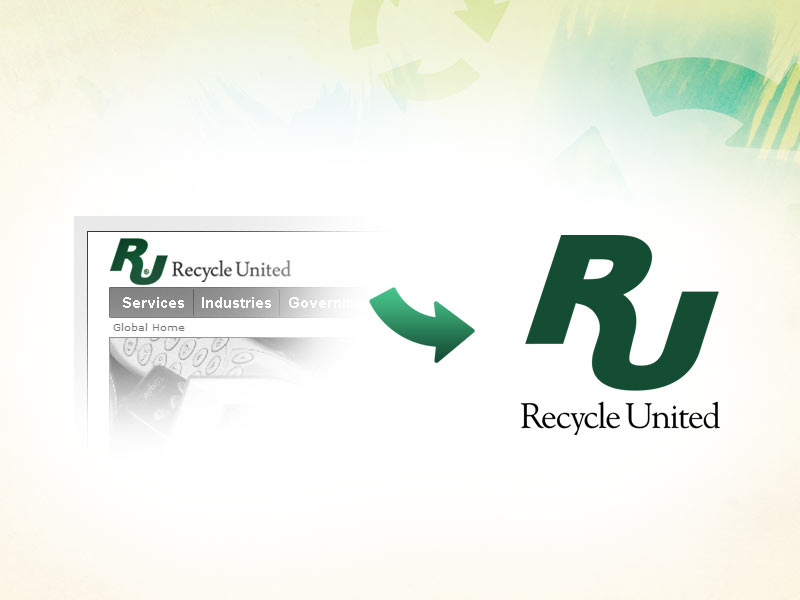
I also did a very slight modification of the original logo. I refined the RU shape and made it much more clean with less “vector points” for optimization. I also redid the type treatment with a new font.
The lush graphics turned out gorgeous and were the driving force behind this piece! Definitely a lot of fun!