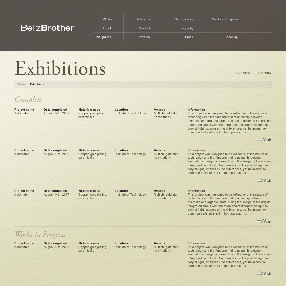
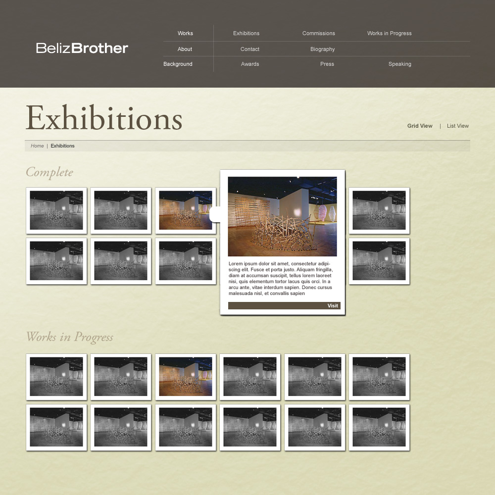
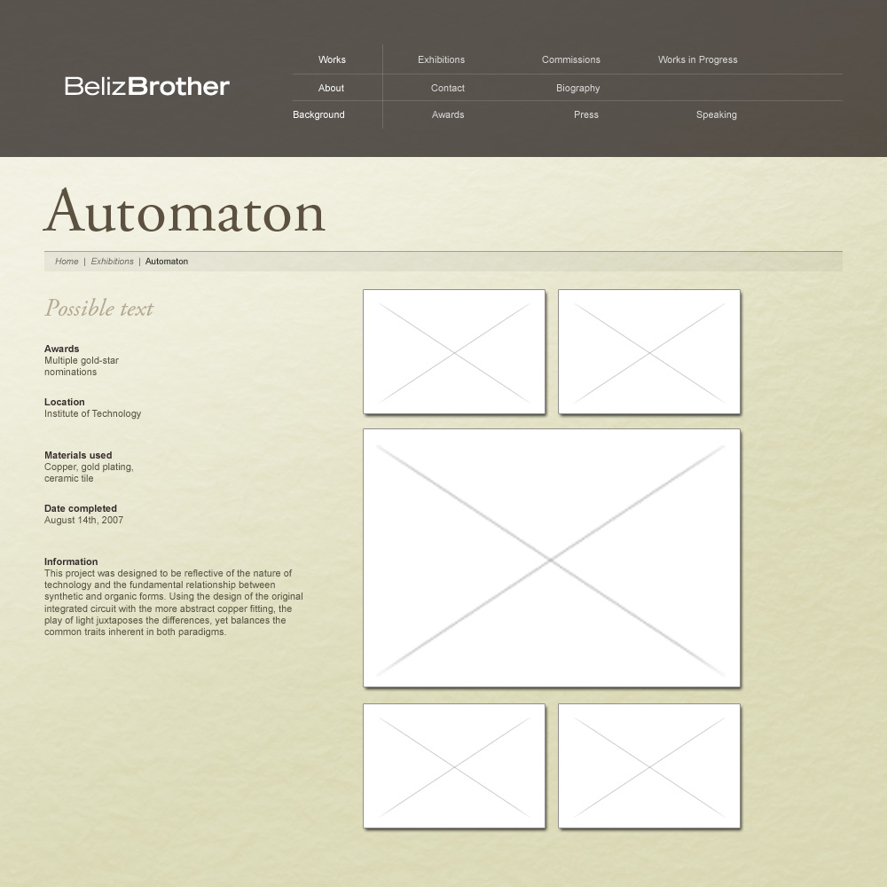
Beliz Brother is a high-profile industrial artist whose work spans across multiple countries and venues. She needed a website that was very simple, but very refined: something that would “get out of the way” of her work, but still be a polished presentation of many of her works.


I put together a very grid oriented designed, and focused on spacing and typography. The design was very simple but it turned out classy and unique at the same time!


I also made a simple logo for her to use, though it was completely informal. It matched the design well so it was one of the few scenarios where the logo is designed after the site. Usually this method is not recommended, but in this case it turned out pretty well, due in part to the client and context.