Smart Tool Studios is a company that makes simple applications to help ease repetitive task-oriented problems.
The SmartTools logo needed to be simple and friendly, and not necessarily targeted to tech-oriented folks.
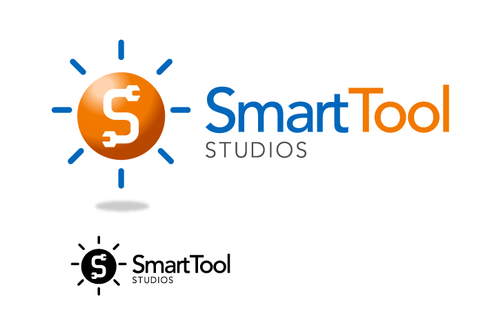
I designed a few different variations, but finally settled on this one, and it’s two variations.

The logos were both simple, but obvious. The “S” letter is reinforced with an obvious tool shape, but wasn’t literal, rather figurative and playful.

The logos were never used, but it turned out to be a great look and a fun experience!