Logo design is filled with critics and advocates of certain processes, but many of these are more cliche and gimmicky than of real use. The art of logo design is still a subtle practice, and it has not yet evolved into something truly formulaic yet highly usable. In short, it’s a work in progress.
Well there is one principle of logo design that I think trumps all the rest, barring research, which of course, is the most important.
What is that “thing”? Iterative design.
Iterative design is the act of designing a thing (in our case, logos, marks, identities) and evolving that design through multiple iterations.
Iterative design is absolutely paramount to uncovering quirks and issues in a logo. After all, a design that doesn’t get revised probably isn’t a good design at all.
Iterative design: everyone uses it, so what?
The traditional method of iterative design is simple: you design a logo, you present it to the client (or yourself) and you step back a second to review it to see if it meets certain criterion.
If not, you find what doesn’t work and you go back. Rinse and repeat until the logo is “done.”
However, I have developed a method that is equally organic, but allows you to approach it in a more formulaic way: evolutionary logo design.
Evolutionary logo design?! What the hell does that mean?
It means when you design your logo, you approach it from the standpoint of evolution.
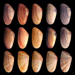
In evolution, mutations occur and produce random results, such as wholly new features or major cell changes. Refinement also occurs, which refines an existing attribute, perhaps chemical dependency, hair color intensity. They are similar but have marked differences. The mutation makes major changes to the phenotype of an individual organism.
Below is an example of some basic refinements in Phenotype of a Mollusk shell. (source: wikipedia)

Mutation and refinement are thus the principles I use when doing my iterative design.
In this context, mutation is defined as: a change in the logo that is very different from the existing “lineage”. It could be a whole new concept, addition to the logo or similar.
A refinement is something that doesn’t stray from the logo’s current lineage, but rather is a small change for better or perhaps even worse. A color change, tweaking font/illustration, etc are examples of this.
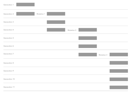
I also have a special way of laying the design out while I’m designing it. This way I can easily see lineage, mutations and refinements.
I first take the logo design, then with each “refinement” I move the next one vertical. With each mutation, I move that to the right.

If I like the mutation, I continue on that path, moving refinements vertically down just like before, but with the new offset cause by the mutation.
This way I can see the evolutionary path the logo has taken and easily trace back different changes. Not only that, you can find patterns in your logo design and perhaps even the client requests when you compare multiple “lineages”!
For example, in this excercise, the logo mutated 3 times and went through 11 generations before it was complete.

I could take these sets of data for each client project and see if I can figure out things like: 1. How long will a logo take on average? 2. How many generations does it take before X thing happens? (like, before a client comes around to a specific idea, or before it works in certain applications.)
It’s a theoretical excercise but it expands the art and brings some interesting data to the table that can actually be useful! Just imagine if everyone used this method and reported their findings. We could pull together massive datasets and learn so much!