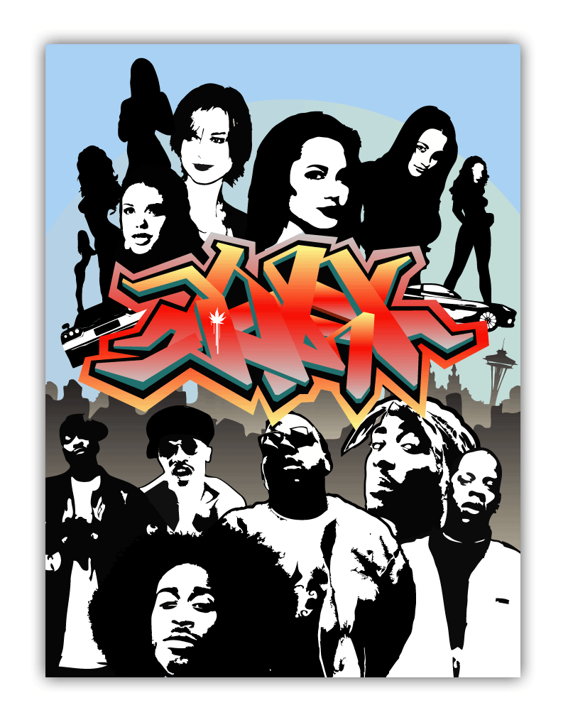
This is an eclectic mix of poster designs I did, for both personal and commercial clients.
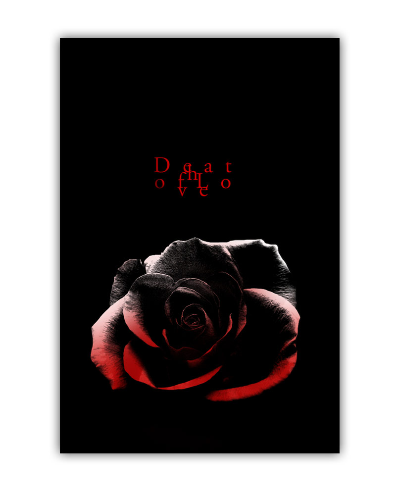
Death of Love
A poster that symbolizes the loss of love, of any type of relationship. The flower is half grayscale and half red, representing the “draining” of emotion that once existed. This was a personal project.
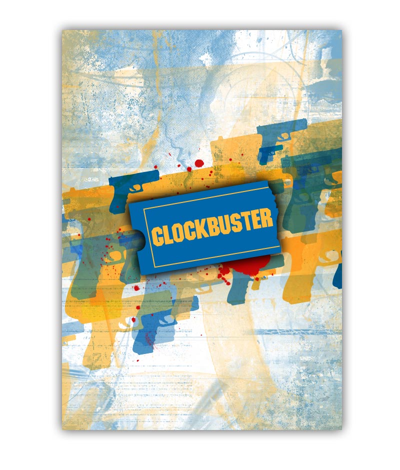
Glockbuster
A play on the company “Blockbuster” but with the gun brand Glock. Yep, that’s it. Straight up gangster.
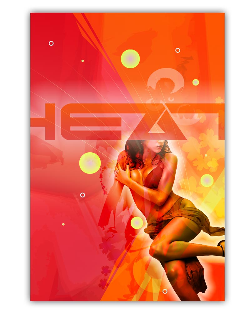
HEAT
Heat is all about representing the intensity of summer with a passionate twist.
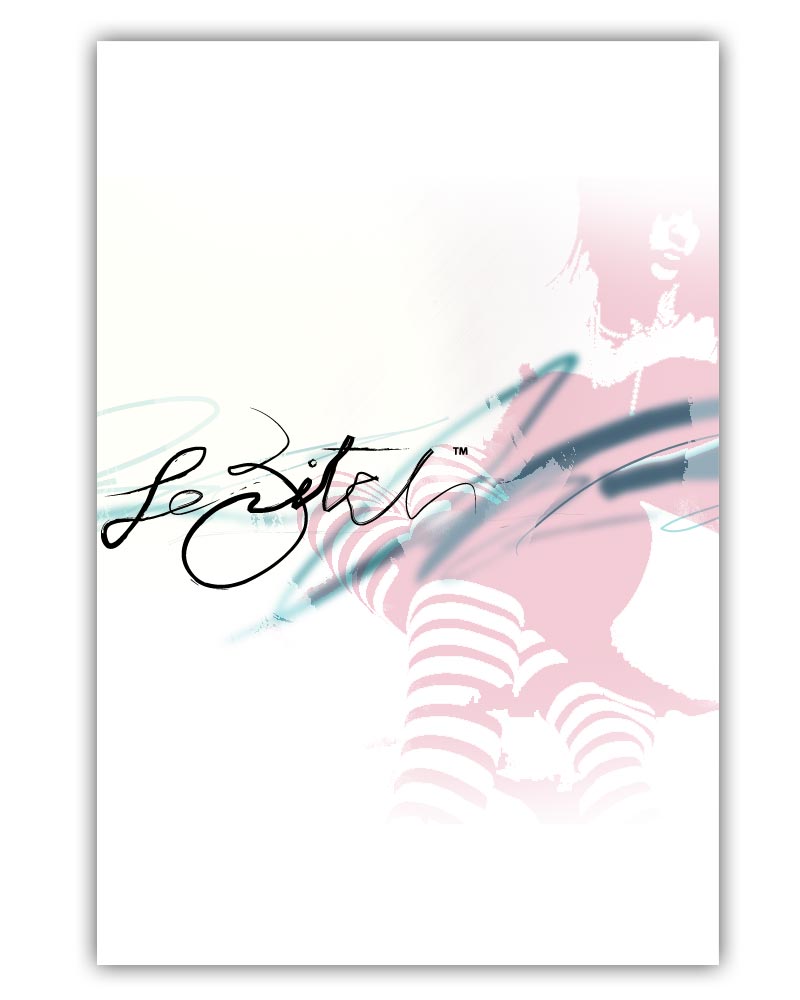
Le Bitch
A tongue-in-cheek design for those who embrace the ‘bitch’ attitude. Not for everyone, but it certainly has a following. This poster was meant to take that appeal and bring more aesthetic quality to the table.
Hope
This poster juxtaposes a rugged and aged face with inspiring words. It represents the uplifting spirit of moving forward, past rough life experiences and isolation. I cropped the face in close to bring a human touch to it. The photo is of a homeless man, and when the context of tattered clothing is removed, one can better relate to this person, regardless of their walk-of-life (this is sort of an example of the ‘face-ism’ ratio for all you design principle geeks out there.)

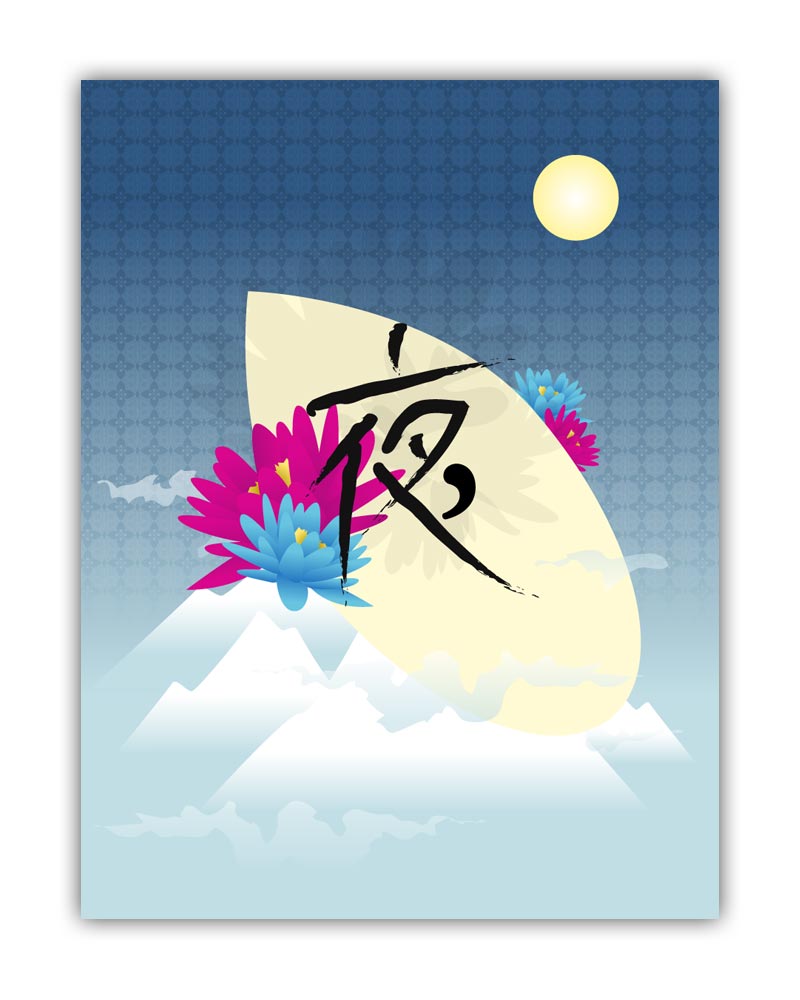
Lotus Night
An abstract Asian themed poster of mountains, lotus flowers and miscellaneous Kanji :). My Japanese is rusty since my schooling so I can’t actually recall the meaning.
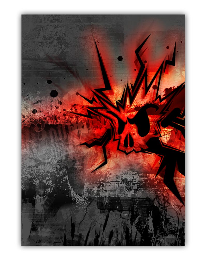
Screaming skull (or 'a very boring and literal title cause I suck at writing them')
This was yet another experiment of mine in my earlier days of vector and photo-manipulation. I really like the color and texture on this one.
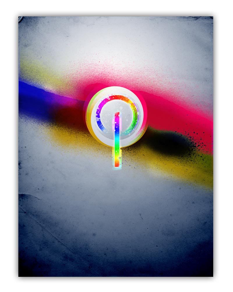
Powered by Color
I like color, it inspires my designs a lot. I love blending the whole spectrum of colors in interesting ways. This poster is all about using color, and the figurative and literal power it represents. Unless you’re a pinniped and have monochromacy – then I feel your fin-footed pain.
Good & Bad
A silly take on the Ying-Yang principle. Happy flower things and mean spiky things (technical terms mind you) are the characters that make up this completely random creation.

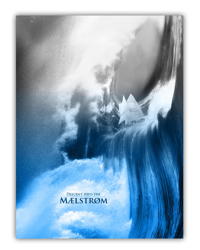
Descent into the Maelstrom
A visual representation of Edgar Allan Poe’s “A Descent into the Maelstrom”. Pretty good short story. I suggest you give it a reading!
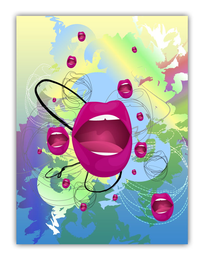
Lips
By now you’ve probably realized that creative titles are definitely not my forte, hence my decision not to become a copy writer (not to be confused with a patent officer.) This was a personal experimentation (like many of my personal projects) that was a refactor of some lip vector shape I had created for a school presentation. I loved the look and feel so I pretty much ran with it and this is what came out.
Positive words
A combination of typography in a positive light. Fun experiment.

"Jon" Birthday poster
I made a poster for my friends birthday. I asked him to give me a mix of his favorite artists cars and people, and redid his name in graffiti. Can you guess whose who?
