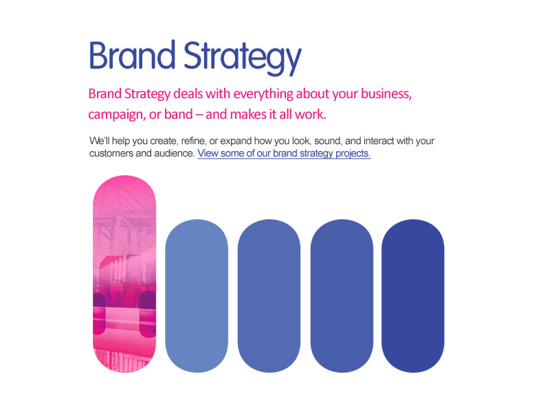
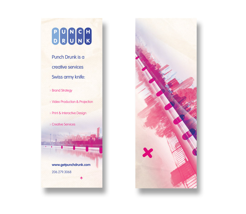
A new design and theme I created for Punch Drunk to inspire the launch of the new site, as well as graphics for future endeavors.
I created custom collages that could extend across any printed piece, as well as online mediums. The result was classy, bold, beautiful and memorable graphics that stood out as a very specific brand feel.
Some initial concepts that were vibrant and luscious, but didn’t mesh as well with the brand
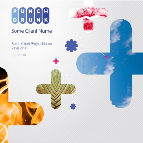
Closer concepts, but still too distant from the vibe of Punch Drunk
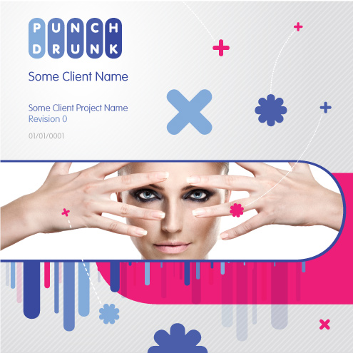
Closer graphics, but still not cohesive. Pretty but lacking the right feeling.
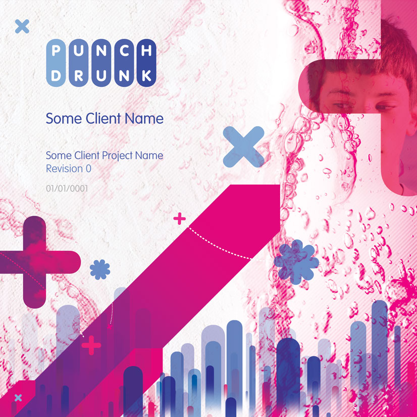
The final core layout, using the new graphics that work with the brand.
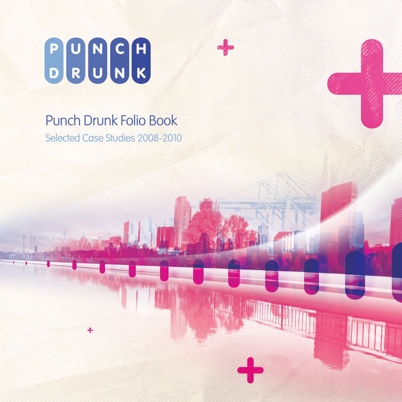
The new look applies the bold and unique color scheme in vibrant ways.
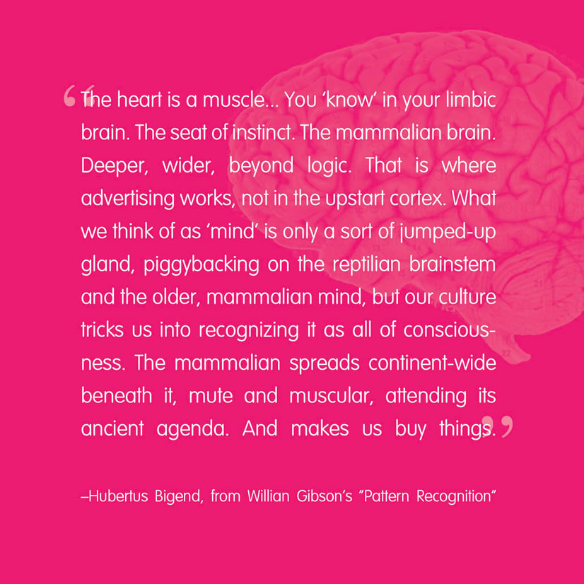
Visually striking graphics are easily created using the simple color scheme, graphic elements and type.
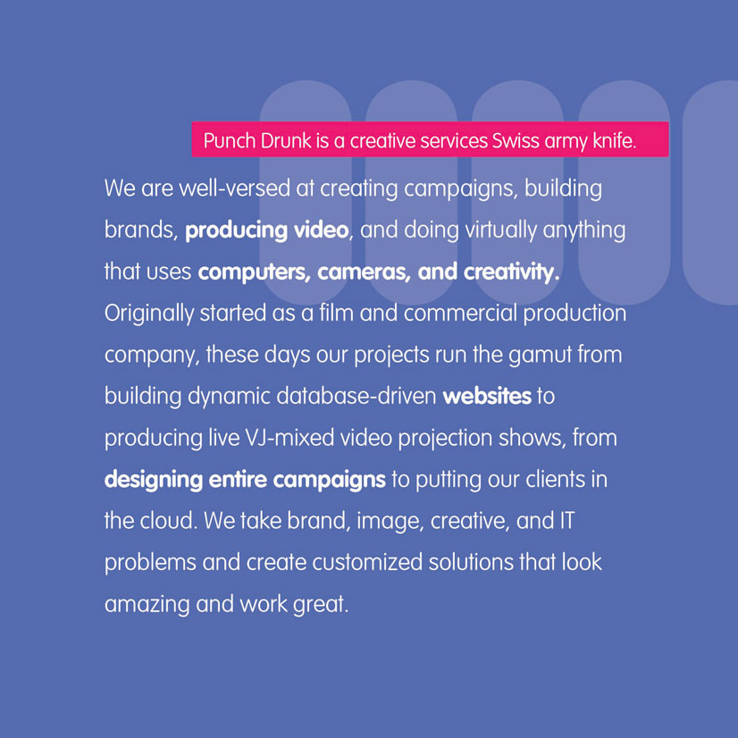
Extending the graphics off into abstractions was fun and looked wonderful.
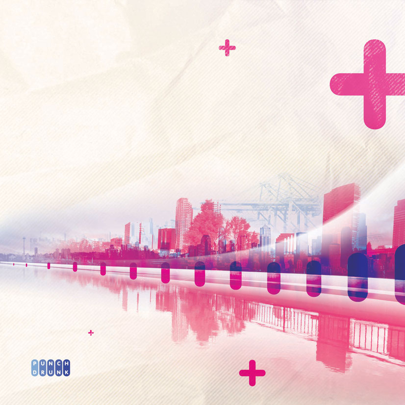
Using the same key design pieces to drive the marketing strategies.
Various applications, such as bookmarks.
More subtle but still “on-brand” printed materials work well.
Memo-pads using the same consistent format.
Created while working at Punch Drunk.
