While working at Punch Drunk, I was tasked with designing a look from the ground up for restauranteur Mike Min and his new company evergreens. The restaurant devoted itself to having fresh healthy items like salad, soups and spuds (hence the tagline). Offering a major salad bar, hot and cold items, and quick service, evergreens was positioned as a healthy but still convenient and cheap alternative to fast-food neighbors.
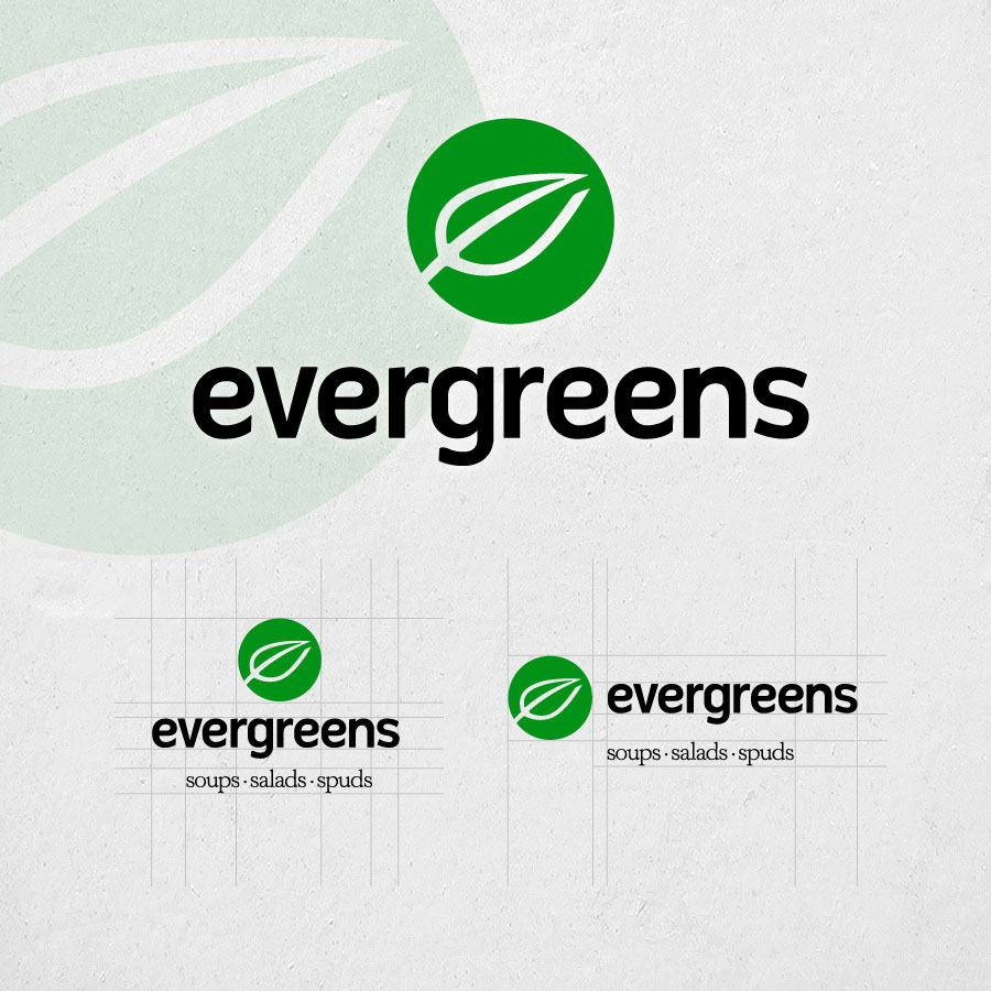
I created the logo as a simple icon in case the company grew to a national level so brand recognition would be easy to achieve.
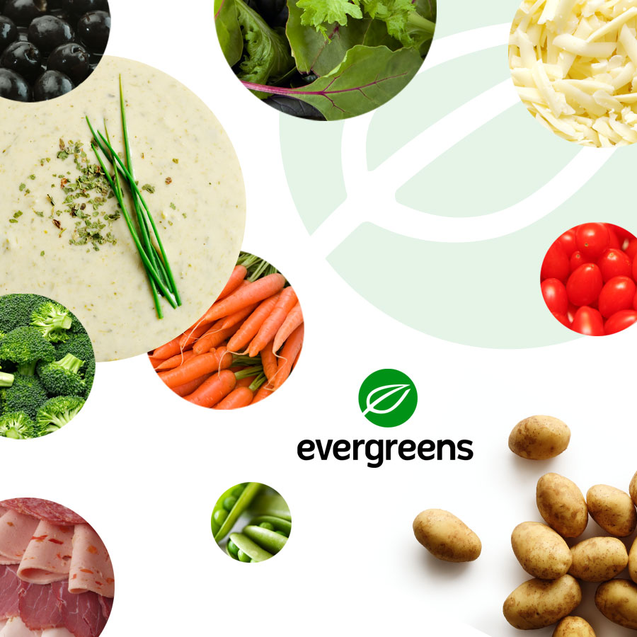
I chose the stock photo library to pair with all marketing assets, blending the color scheme with real photos and creating a wide range of potential shots for different contexts and mediums.
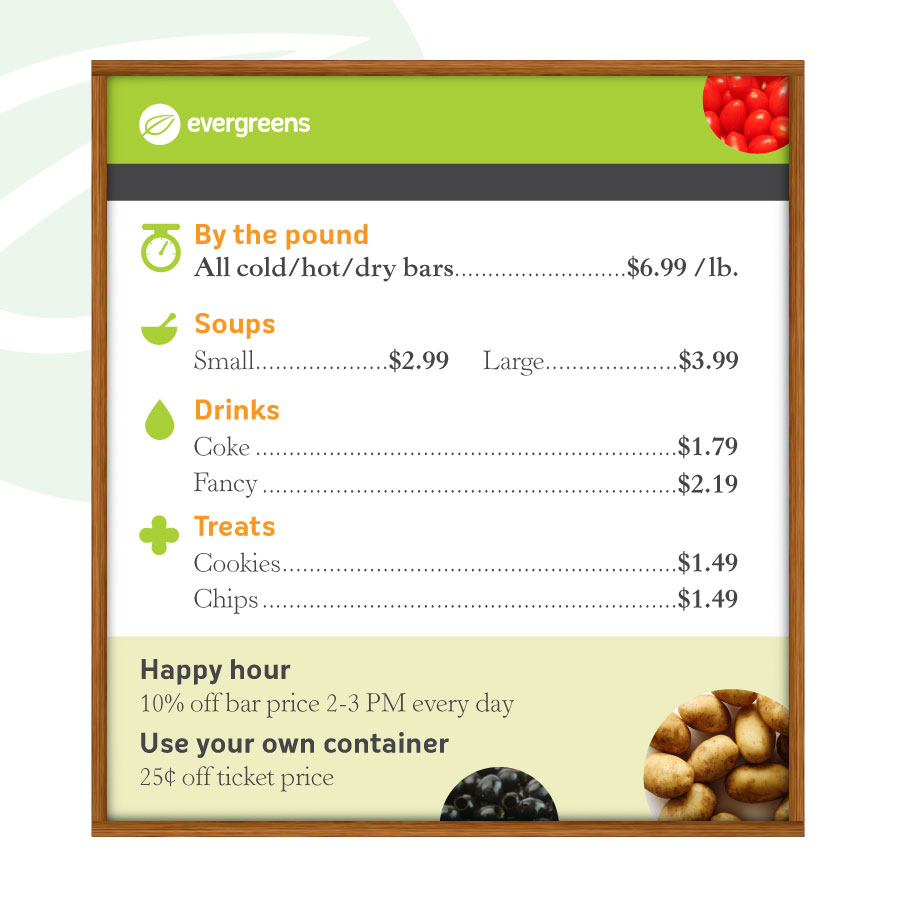
Signage that hangs over the register for ordering. Custom icons were also created.
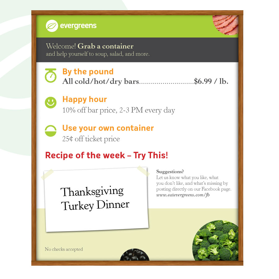
Entrance signage that explains the ordering directions: grab a cup and go! A spot was left open in the design to accomodate constantly changing menu specials that could be added to the sign, whether by print out or chalkboard design.
Mailers for the grand opening. Simple business cards were also made.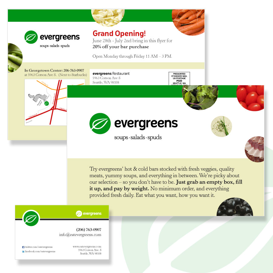
The final logo, that combines three concepts elegantly: an “e”, a fork, and a leaf. Heavily modified type made the wordmark clean and legible. The font choice was forward, but not dated, and not too stuffy. A sans-serif was chosen for this reason, creating a look that is fresh, healthy-food oriented but still reminiscent of a business that’s fast and convenient.
Overlays also show the careful attention paid to symmetry and final tweaks.
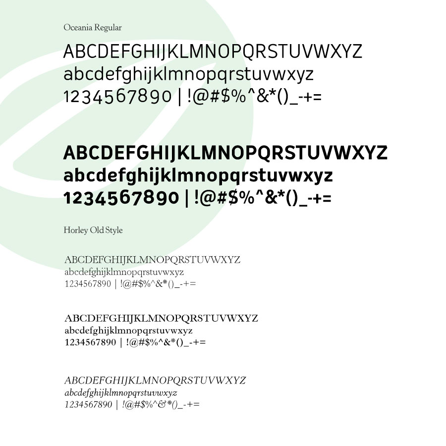
Final typeface choices. A sans-serif was chosen as the primary font to convey boldness and convenience, while a complementary font (Horley Old Style) was added to offset the look with something elegant and friendly.
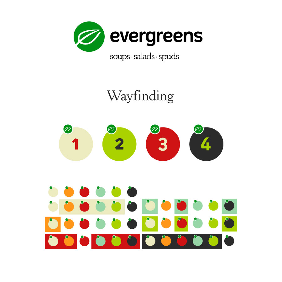
Logo with wayfinding markers and visual system that allowed for various information to be added to a wide selection of color cues and schemes.
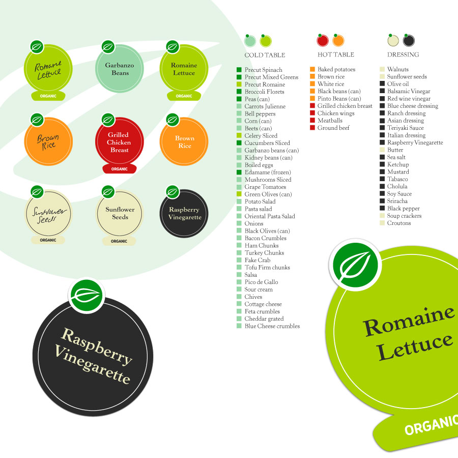
Custom labels for foods and “sneeze guard” containers were made that indicated the type of food and whether it was organic or not. The labels were designed to be used as blank, handwritten vinyls or pre-made stickers. A visual guide to hot/cold/neutral foods was created to help facilitate categorization.
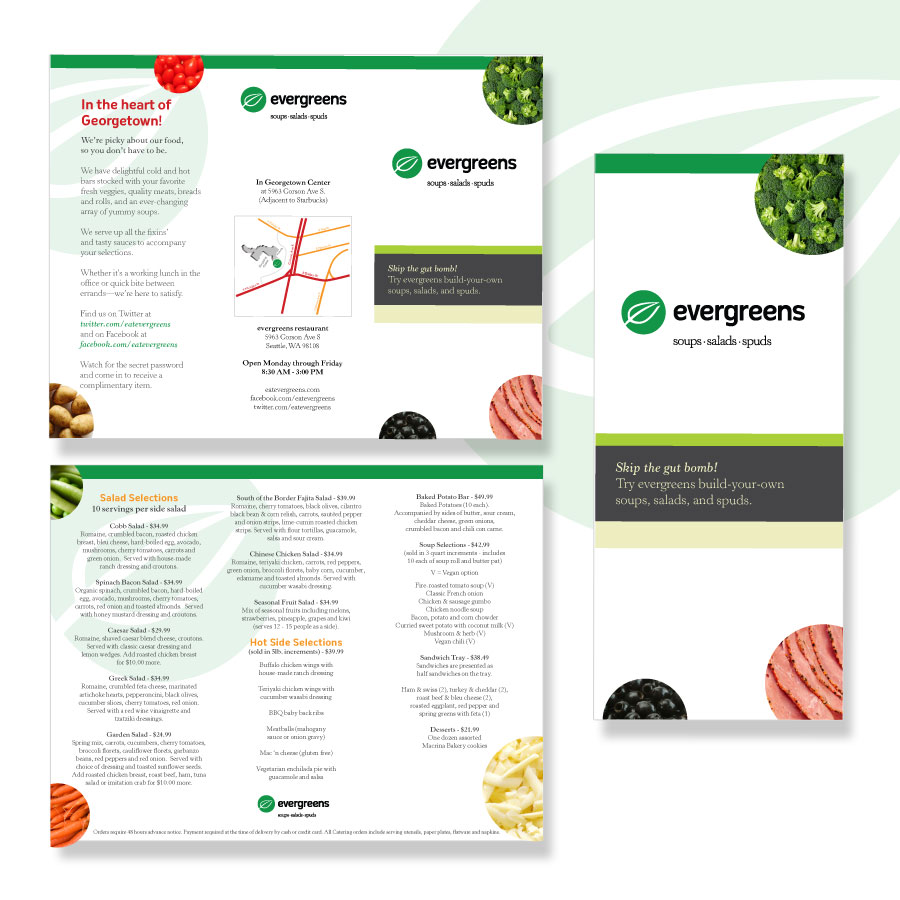
Menu and promotional Tri-fold brochure.
It was an awesome project, and a first in many ways! I highly enjoyed having full creative freedom and seeing my ideas come to life in an actual storefront. If you have a craving for a quick lunch, go eat at evergreens!