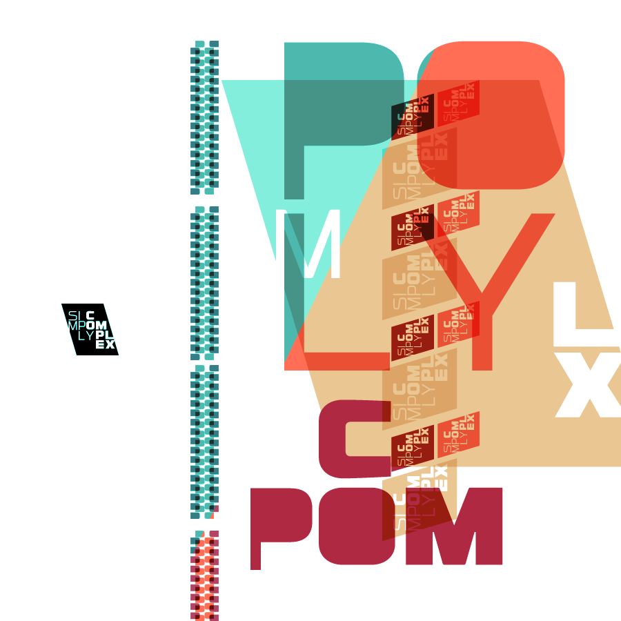
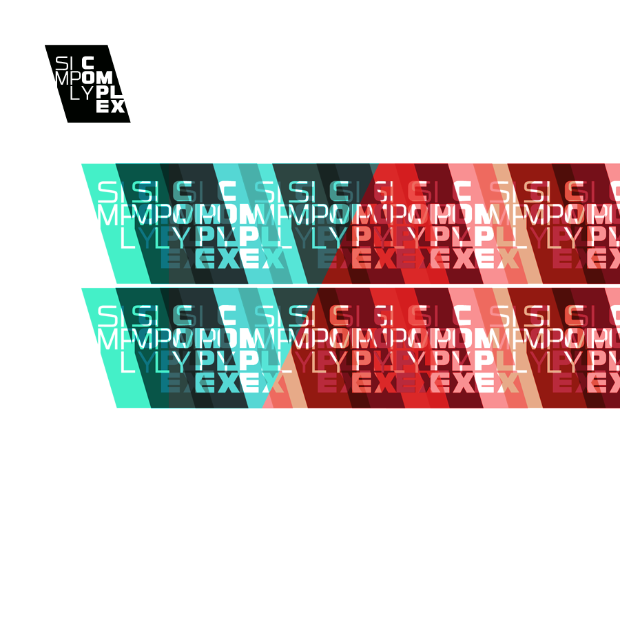
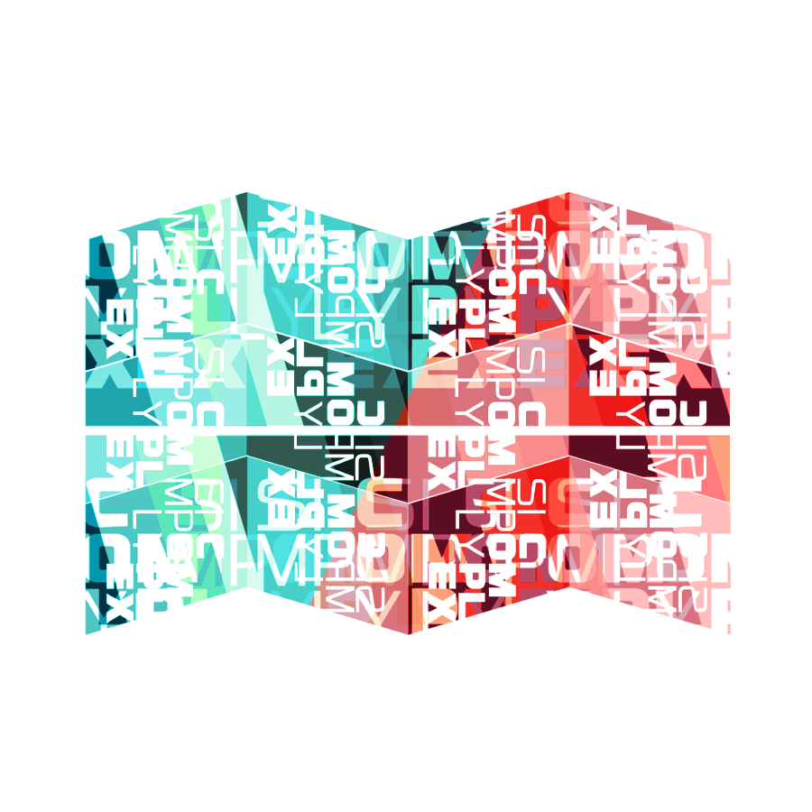
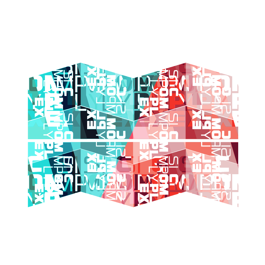
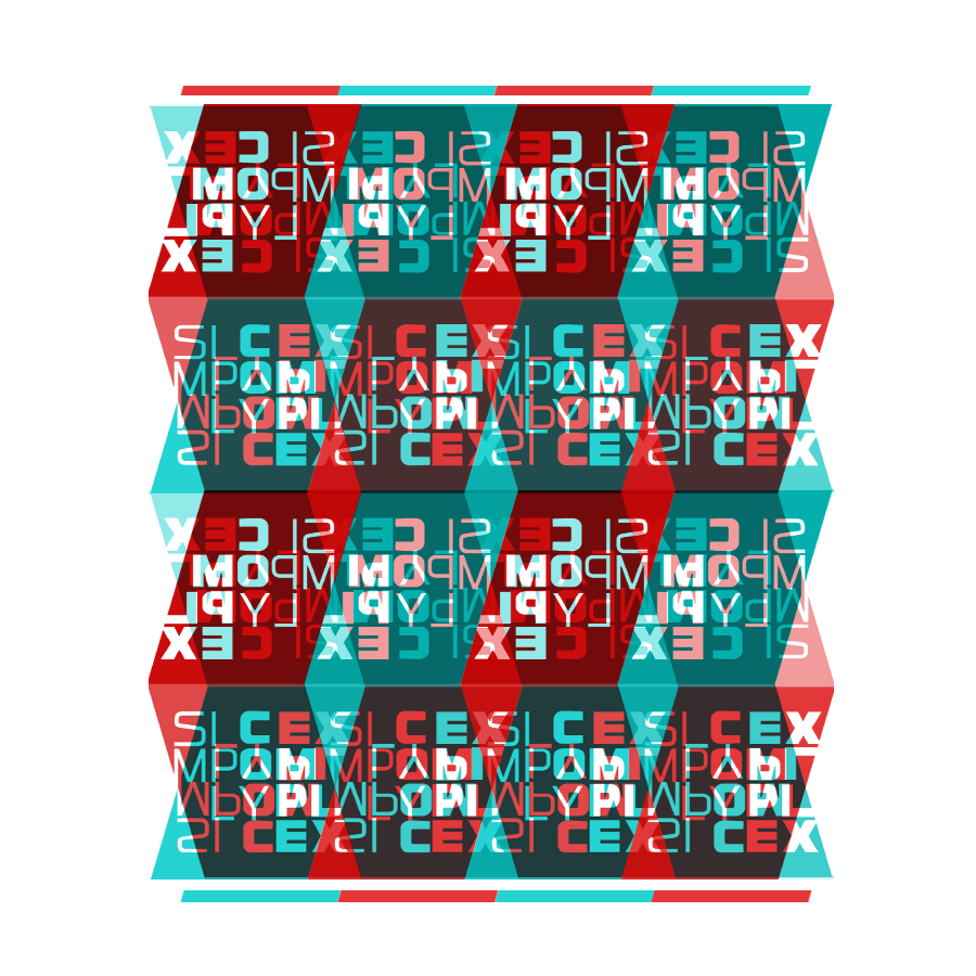
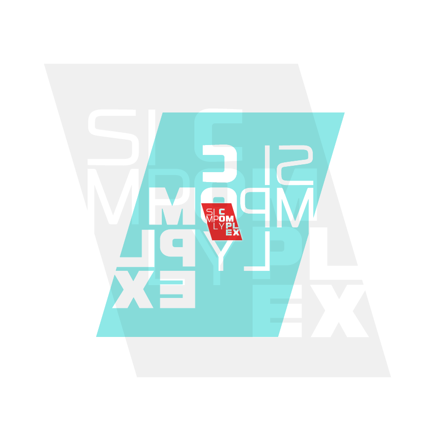
A conceptual logo and idea of mine. The idea behind this was to take a simple logo, but apply it in a complex way, that would be recognizable as a branded company. I used the angles of the letterform “container” and played off the geometry of that shape. Using overlays and multiple layering (a technique I’m rather fond of) I was able to coax out many interesting shapes and variations. I also used some of the individual letters and pieces to create new shapes and patterns as well. A fun excercise for a Saturday morning!
