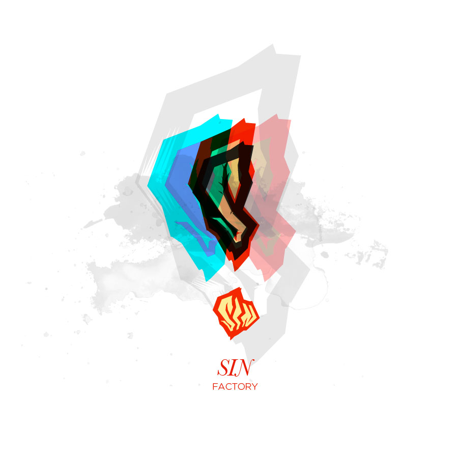
I got hungry for some designin' and took a sketch from my notebook (graffitti style typography) and decided to digitize. The word of course, was SIN, a made up name that seemed cool at the time. It evolved into this branded effort, with lots of collaging and layering as things often do in my domain. The “factory” part came about simply because of my need to create sets of things, whatever the design may be.
My favorite variation–the colors and vibrancy are nice.
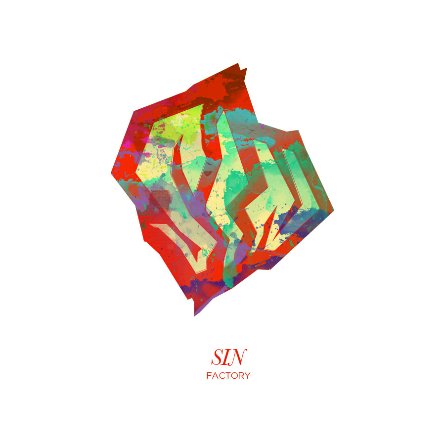
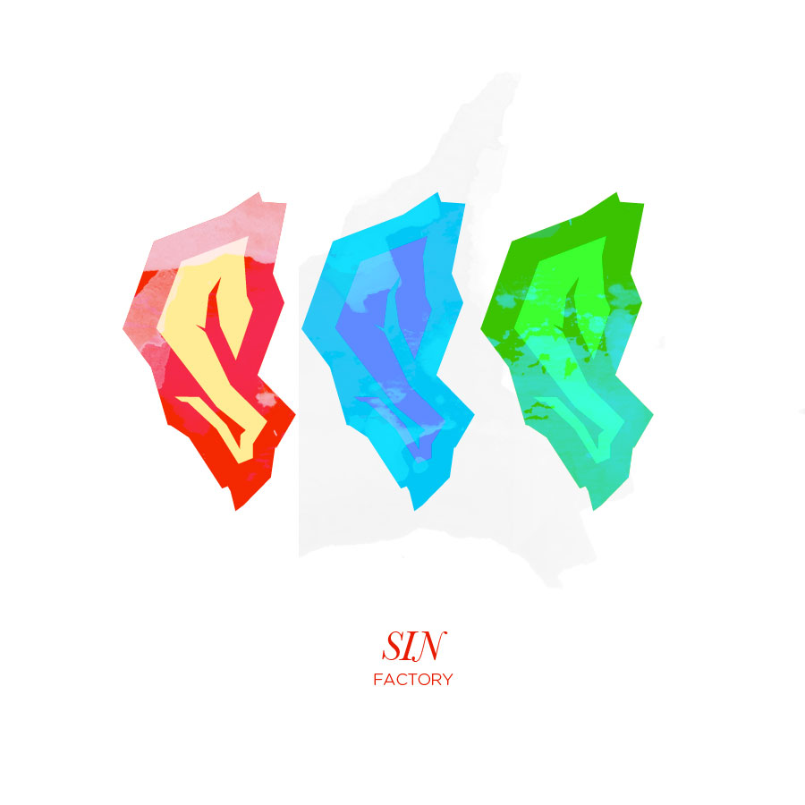
A silhouette of patterned logos.

Logos, logos, logos. When the logo becomes the art form, the possibilities are almost endless.
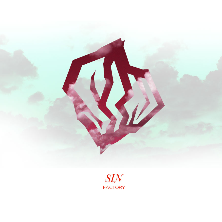
I decided to go on a cloud kick–it seemed appropriate. My favorite part here is the instant shift from having white clouds and expressing the feeling of lightness, air, freshness, to changing the colors and creating a dark, smoky, war-torn atmosphere. A simple flip of a switch changes the entire concept. This particular screen screams “Black Metal cover” and is giving me serious pause on career choice.
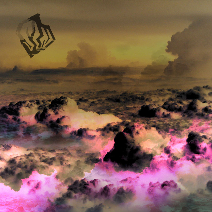
Another, lighter variation on clouds. The logo lends itself well to being a “dynamic” or changing logo, where the artwork is constantly swapped out in and around it.
Creating movement with the shifting and scaling of logo along with overlays.
