I not too long ago stumbled upon a nifty site called www.fiverr.com, which offers any sort of service you might want or need, for only $5 a pop. Sounds interesting right? Of course this is more of a fad than a real business model, but its pretty fun regardless, and it might work for you. In signing up, I perused a few different categories and found logo design prominently featured.
Of course I was very intrigued. I had a fiverr (digitally) to spare, so I figured why the hell not – I’ll chalk it up to research, and post the results for you.
Getting started
Out of respect, I’ve not revealed the profile of the creator – they were operating in a different country however.
I was asked to provide a few pieces of information for them to get started.
Please provide the following....PLEASE CHECK GIG EXTRAS BEFORE ORDERING...! 1 - Logo type [text, image or text and image] 2 - Text or Image to be added if any 3 - Color Choice 4 - Target Audience 5 - Your Website if any 6 - Logo dimension ====================================== We assume that you have read the gig description clearly. Gig delivery in 24 hours and updates in 48 hours - any failure will get you a FREE GIG!
Great, simple enough. Not quite the “market research” I was hoping for, but hey its $5 dollars. I replied back with the following:
1 - text and image. 2 - “ ChangeIt ” 3 - dark purple, and any other appropriate colors that look good. 4 - online social media goers, progressive young adults and middle-aged tech savvy. 5 - N/A. 6 - 300 wide x 150 high.
After a mere 24 hours, I received a follow up email indicating my job was ready. “Woohoo!” I exclaimed. I could hardly wait to see what was awaiting me, if only out of a perverse curiousity.
Below is the final logo that I was given.

As I said, this post is meant to be a completely unbiased look at this model, and a real example of it in action. Let’s look at the pros and cons.
My critique: the pros
- The turnaround was very fast.
- The technical details were effectively addressed (color, name and dimensions)
- The name is bold, which is somewhat appropriate given its a group for an organization of change.
- It has some meaning beyond the obvious (e.g. the Saturn like planet).
- The design is fairly simple.
- The design does not seem to copy and obvious iconic cliches or registered marks.
My critique: the cons
- I had no access to a hi-res file, or vector (this was another job, set at $5 -- an interesting technique that has grown organically from the fiverr model is to use "ala carte services" that add up to more than five dollars.)
- The typography is lackluster, and has little or no kerning from what I can discern.
- The icon has no relevance to the name, except the subtle reference to a planet, which is more like Saturn than Earth (perhaps a more progressive planet?)
- I like using a primary first-letter as the icon of a logo in some instances where it seems appropriate. A good example is when the name is short and the first letter has a deep and obvious connection to the name. (I did this with great effect on Choclopedia.) In this case however, it does not add much value to the recognition.
- It has visual clutter - the box, the "sheen" effect, and the embossing effects all serve no purpose except to give weight to an otherwise empty icon. Visual effects should be used sparingly, and should serve only to add polish that is normally unnecessary under any given context.
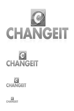
- As seen below, it completely breaks down in grayscale and scaling.
- There is no black and white version that could be used in limited printing contexts or simpler application.
As you can see, the logo immediately shows weakness when resized and grayscaled. A great logo must work in black and white, and a good logo can hold up under normal conditions, such as resizing and simplified printing. Alluding to my earlier point, effects should serve to enhance, not provide a crutch, for visual acuity.

Concluding
So, what do you think? Is it a fair judgement? Was I too mean? Not harsh enough? I’m curious about your thoughts and experiences on both sides, so please feel free to comment!