I just wanted to make some logo landscapes and weird abstractions from corporate logos. That is all. Feel free to comment or share your own!
Awesome abstraction, nothing conceptually specific. Just having fun!

I decided to make a little “corporate castle” for this one. The “W” crest at the top is from the Best Western logo, if you weren’t sure. Don’t you love the little chupa-cup-adidas flowers? It seemed like a perfect fit.

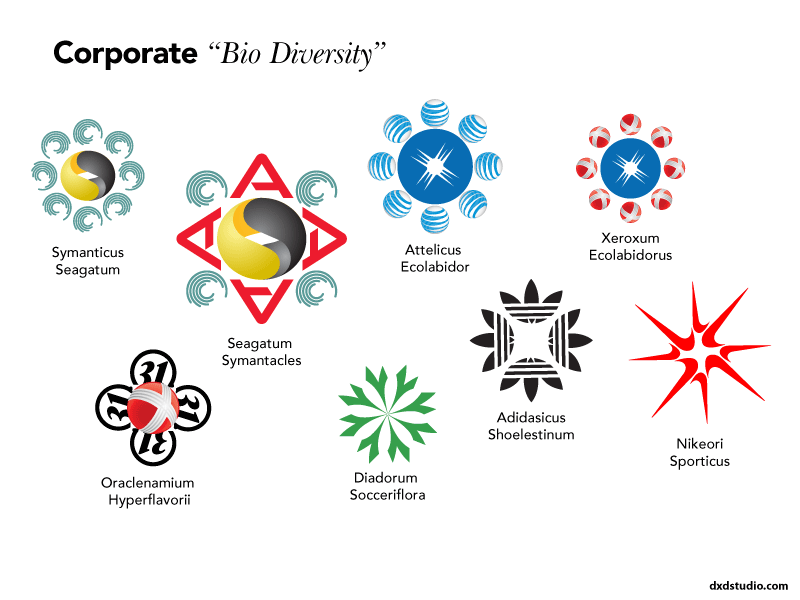
I thought symmetric shapes might be a nice finale, so I made some “corporate flowers” out of various logo icons. Much prettier in their abstracted form!
